living·objects is a leading provider of network performance management solutions for operators and service providers. living·objects’scalable platforms monitor, manage and optimize mobile, fixed or converged multi-technology network infrastructure as well as the associated deployed services.
The mission was to defining its overall design, artistic direction, and enhance the UX/UI of applications.
Key contributions included:
- Rebrand living·objects’s visual identity.
- Developing a coherent and distinctive art direction across all media and touchpoints.
- Create a responsive design system.
- Develop user experience and user interface for applications.
Maturity
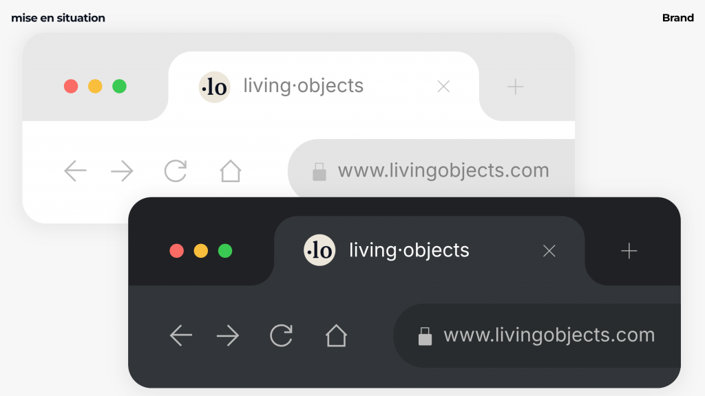
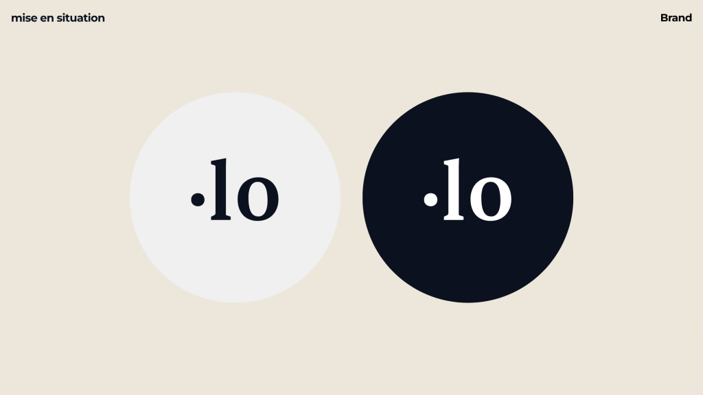
The use of a serif typeface creates a tension between tradition and modernity: the contrast between thick and thin strokes structures reading, reinforces the institutional grounding, and provides greater visual stability within the logotype.
Readability
The middle dot makes it easier to read living·objects.
Distinctiveness
The use of the middle dot acts as a mark of identity punctuation: it gives rhythm to the reading, introduces a graphic pause, and serves as a visual landmark—thereby reinforcing the structure and uniqueness of the logotype.
Code
The integration of a shape evoking the numbers “1” and “0” refers to the world of binary code (1/0), creating a direct bridge to the digital and technological culture on which the brand’s identity is founded.