
Case study · EdTech SaaS
Wazadō: making progress visible
A SaaS that turns a competency framework into a visual skill tree, like the ones in video games. Learners see where they stand, trainers validate in one click, and academic leads spot blockers before the final assessment.
Context
A project born in a classroom
Wazadō comes from my own experience as a trainer and academic coordinator. I saw both sides of progress tracking. As a trainer, you fill in a spreadsheet. As a coordinator, you try to merge files that never look alike. And the learner sees neither.
I led the project end to end, on my own: product framing, research, UX/UI, brand identity, design system and development of the SaaS, all the way to launch.
技 + 道
Waza means technique; dō means the way. As in judo or kendo, the “-dō” suffix names a path of gradual mastery, not an isolated technique. That is the whole idea behind the tool.
The problem
A grade says how much, never what.
A 12/20 folds into a single number what has been mastered, what has been neglected and what has never been covered. A grade ranks learners against their class, not against their own progress. The real tracking sits in a spreadsheet nobody opens.
Learners fly blind
They know what they did last week. Not where they stand in the course, nor what is left to learn.
Drop-out shows up too late
The warning comes at the end of the semester, when there is little left to catch up on.
Every trainer has their own file
No overview of a class, let alone of the whole school.
Tracking skills shouldn’t feel like filling in a spreadsheet.
Where the project started
Why not use an existing tool?
Skill trees are not a new idea: Freinet pedagogy uses them, and so do HR tools. Yet the benchmark revealed a niche that was still open.
| Criterion | SkillTree (open source) | HR tools (e.g. Gingo) | Wazadō |
|---|---|---|---|
| Audience | Corporate / dev training | Companies | Trainers and schools |
| Visuals | Badges and levels | HR mapping | A real tree of nodes and links |
| Setup | Self-hosted Java/Spring | Enterprise rollout | Turnkey SaaS, runs in the browser |
| Language | English | Varies | French first, multilingual |
The solution
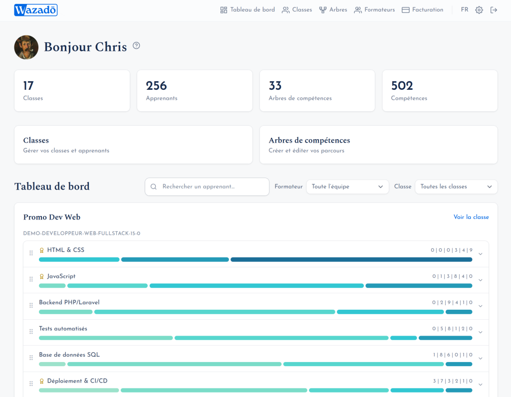
The curriculum becomes a map.
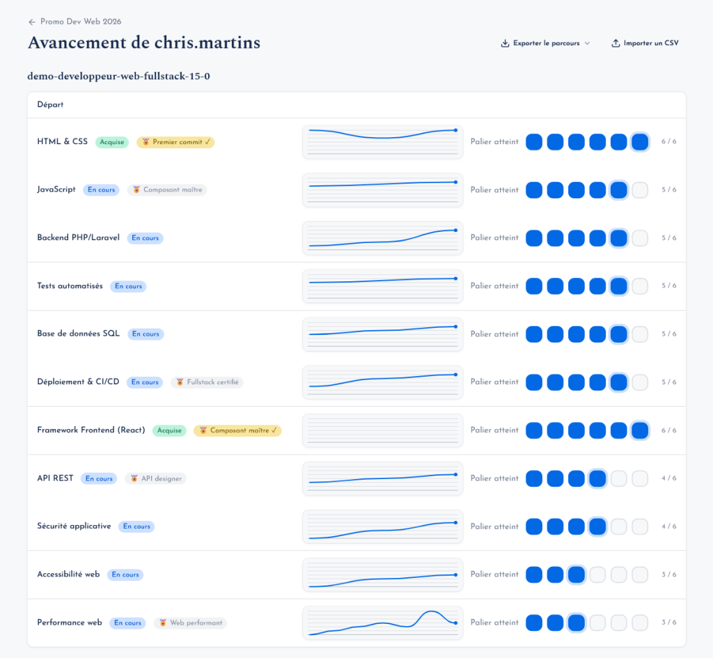
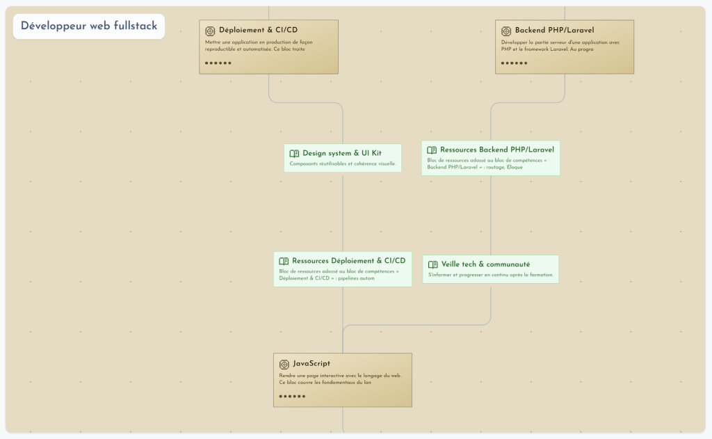
Each skill is a node, each prerequisite a link. The tree reads from bottom to top, and each skill is validated through mastery levels (five by default). Half-mastered work shows up, instead of being stuck on “not acquired”.
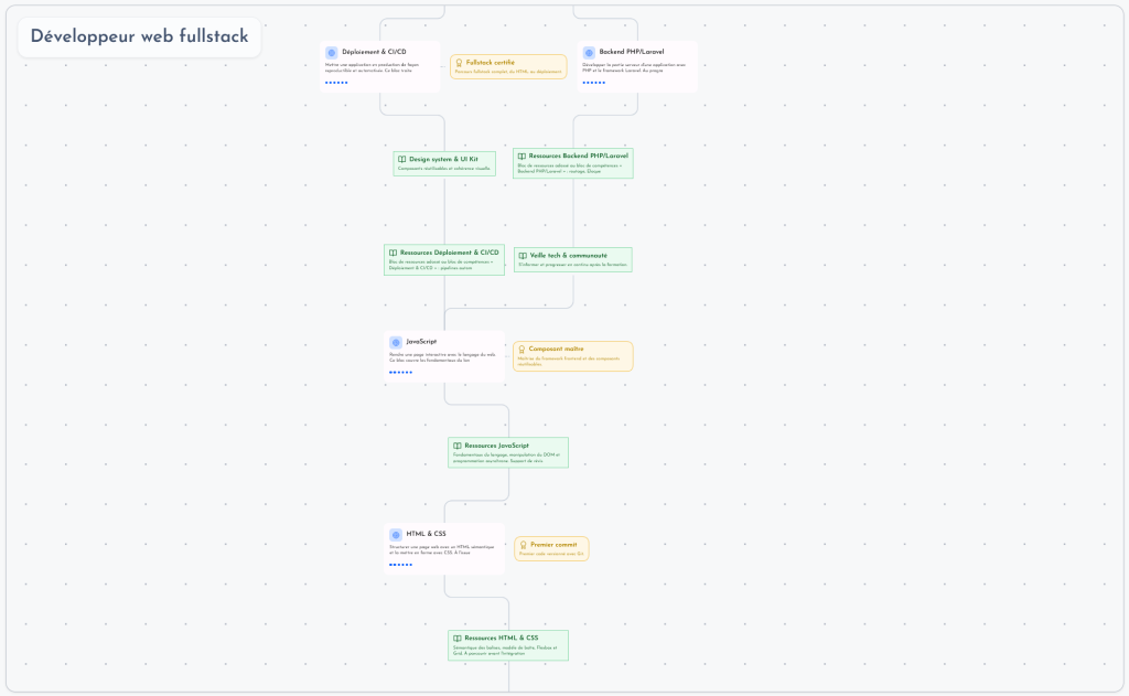
One dataset, three readings. I designed one view per audience, each built to answer a specific question.
Learner
“Where am I, and what comes next?”
- Their map, always at hand: acquired, in progress, locked
- Badges unlocked automatically at key milestones
- Resources (video, PDF, link) placed right on the skill
- Their own language and visual theme
Trainer
“One click to validate, no spreadsheet to fill.”
- Visual editor: drag and drop, links drawn with the mouse
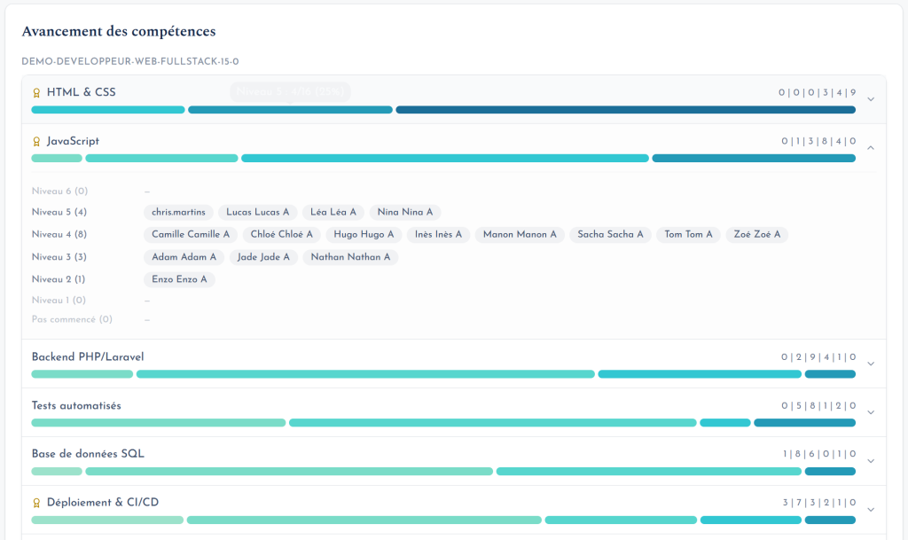
- Class view: the whole group on screen, one click per level reached
- Import from Word or Markdown, vector PDF export
- One tree reused from one cohort to the next
Academic lead
“Where are learners stuck, before the final review?”
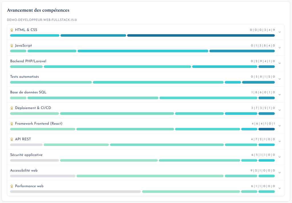
- Completion rate, skill by skill
- Blockers surface on their own, with names
- Consolidated view: every class, every trainer
- A learner’s path exportable as a PDF
UX process
From the field to a live product
- Start from field experience. My years as a trainer and academic coordinator were the first round of research: spreadsheet pain points, review meetings where drop-outs are discovered too late, learners asking “what do I have left?”.
- Test it against other practices. Dozens of conversations with trainers, academic leads and learners revealed the same frustration: tools are missing or ill-suited, so trainers improvise with Excel and lose valuable time
- Benchmark. Freinet pedagogy, HR tools, SkillTree: the concept exists, but not for independent trainers or French-speaking schools, and rarely as a truly visual tree.
- Three audiences, three questions. Learner, trainer, academic lead: a single source of data, three views, each designed for one decision.
- Prototype in the real product. Since I build it myself, I iterated directly in the application: over a hundred releases shipped, each adjusted based on real use.
- Open the beta. The SaaS is live and used by its first trainers, with a free plan to lower the barrier to entry.
Design principles that guided the work
Humans make the call
No auto-graded exercises: the trainer validates, level by level. The tool saves time without taking away pedagogical judgement.
Levels, not all-or-nothing
A skill’s colour grows more saturated with each level. Grey until acquired, it reveals partial progress instead of hiding it.
Learners own their tree
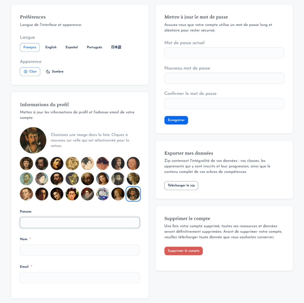
They pick their own visual style, whatever theme the trainer chose. Motivation also comes from feeling that the path is theirs.
Zero-friction onboarding
Nothing to install, import of the existing curriculum, invitations by email or QR code. The goal: a first tree in under two minutes.
Honest interfaces
The landing page animation reuses the editor’s real curves and cards.
Respect for data
A single cookie, strictly needed for the session. No advertising trackers and no third-party analytics.
Branding
A path, not a checklist
The name carries the idea of progression. The identity had to feel serious to a school director and warm to a learner: a literary serif for the voice, a geometric sans-serif for the interface, and a bold blue as the anchor.
Logo
The symbol is a knocked-out W inside a blue cartouche whose right edge is cut at an angle, suggesting forward motion. The W echoes a check mark, the gesture of validating a skill, which sits at the heart of the product. The whole aims to feel reliable and effortless: a tool you trust at a glance. Usage rule: the full lockup wherever it fits; the symbol alone only below 120 px (favicon, app avatar).
Typography
Aa
Every skill is part of a path.
A literary serif with subtle serifs: the product’s voice, calm and educational.
Aa
Validate level 3 · 12 learners
Geometric and light, with a hint of vintage: readable on dense screens.
Colour
oklch(0.552 0.190 258)
oklch(0.285 0.078 264)
oklch(0.972 0.018 258)
oklch(0.212 0.026 264)
oklch(0.640 0.150 152)
Brand ramp, 50 → 900, generated in OKLCH at a constant hue (~258):
Tone of voice
Short, concrete sentences with no EdTech jargon. The product is written in French with inclusive language, and it talks about visible effects (“progress shows”, “motivation follows”) rather than features.
Four worlds for the trees
Separate from the brand, the trees have their own art direction. Each learner picks one, for the same curriculum structure:
- Swiss: grid, sharp corners, signal red
- Cyberpunk: neon, circuit-board links
- Medieval: forged chains, sepia
- Candy: pastel, very rounded corners
Design system
A system built for code
As both designer and developer, I built a design system specific to Wazadō, a single source of truth between mockups and production. It covers the application’s “chrome”: navigation, forms, dashboards, validation, organisation management.
2
token layers: primitive and semantic
~20
documented components: anatomy, states, accessibility
AA
WCAG throughout, AAA targeted for body text
2
themes, light and dark, following the system setting by default
Token architecture
--wz-brand-500 --wz-neutral-200 --wz-radius-md--color-surface --color-content --color-border.wz-* classes and Tailwind utilities.bg-surface text-content .wz-cardKey decisions
- OKLCH for perceptually even ramps and predictable contrast
- A “balanced and welcoming” personality: 10 px default radius, soft shadows, micro-interactions
- Feather icons only, driven by the text colour; no emoji in the UI
- Built-in accessibility: visible focus, keyboard navigation,
prefers-reduced-motion, review checklist
Deliverables
- Tokens in CSS and in JSON using the W3C Design Tokens format
- Tailwind preset: dark mode works without the
dark:variant - CSS component library usable in Blade views
- Living style guide with a light / dark / system toggle
- Button
- Fields
- Card
- Badge
- Alert
- Tabs
- Modal and drawer
- Menu
- Tooltip
- Table
- Pagination
- Breadcrumb
- Avatar
- Navigation
- Toast
- Empty state
- Loaders
- Progress bar
Results and next steps
Live, in open beta
Wazadō is in production with a freemium model: free to get started, then a Trainer plan and an Organisation plan for schools. The first trainers are using it with their classes.
What this project taught me
Owning the problem, the design and the code at once makes the loop between a hunch and its validation dramatically shorter. The design system made that possible: without it, that speed would have produced an inconsistent interface.