living·objects is a leading provider of network performance management solutions for operators and service providers. living·objects’scalable platforms monitor, manage and optimize mobile, fixed or converged multi-technology network infrastructure as well as the associated deployed services.
The mission was to defining its overall design, artistic direction, and enhance the UX/UI of applications.
Key contributions included:
- Rebrand living·objects’s visual identity.
- Developing a coherent and distinctive art direction across all media and touchpoints.
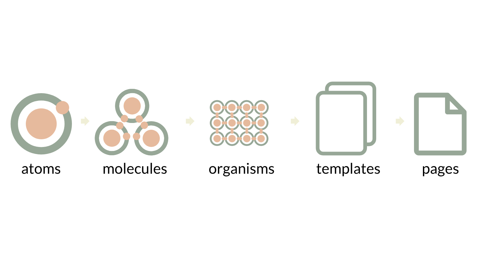
- Create a responsive design system.
- Develop user experience and user interface for applications.

The Challenge
living·objects is a leading B2B provider of network performance management solutions for telecom operators and service providers. Yet their visual identity didn’t reflect that positioning.
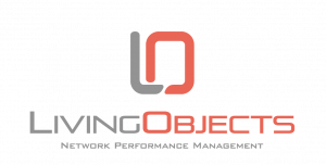
The old brand was playful and colorful—perfect for a consumer startup, but misaligned with the serious, institutional context of their market. When pitching to enterprise telecom operators, the brand communicated « innovative startup » instead of « established, trustworthy infrastructure partner. »
Problems with the old identity:
Too illustrative & detailed : The logo was a complex network illustration with gradients, curves, and internal patterns. This over-designed approach made the mark difficult to scale down-at small sizes (favicon, email signature), the details became muddy and unclear. It lacked the simplicity required for a professional B2B brand.
Generic typography : The sans-serif typeface was standard and interchangeable. It communicated nothing about the brand’s positioning or personality. Thousands of companies use the same typeface.
Limited flexibility : The design required full color to work. The complex interior patterns meant it couldn’t be reproduced in monochrome (black & white, single color applications) – a critical requirement for professional B2B materials.
Visual imbalance : The heavy, detailed symbol was paired with thin, light typography. This created visual tension that made the logo feel top-heavy and unbalanced, especially in smaller applications.
The Goal
We needed to completely reimagine living·objects’ visual identity to:
✓ Establish institutional credibility
Convey maturity, stability, and trustworthiness—the qualities that enterprise clients need to see.
✓ Create a distinctive, memorable mark
Design something that couldn’t be confused with competitors. A visual signature unique to living·objects.
✓ Enable scalability across all applications
A mark that works from a favicon (16px) to a billboard (300ft). No compromises at any size.
✓ Support a cohesive design system
Move beyond logo to create a complete visual language that scales across all digital and physical touchpoints.
✓ Communicate technological sophistication
Reflect the innovation and precision of their platform, not just its purpose
The transformation
Maturity
The use of a serif typeface creates a tension between tradition and modernity: the contrast between thick and thin strokes structures reading, reinforces the institutional grounding, and provides greater visual stability within the logotype.
Readability
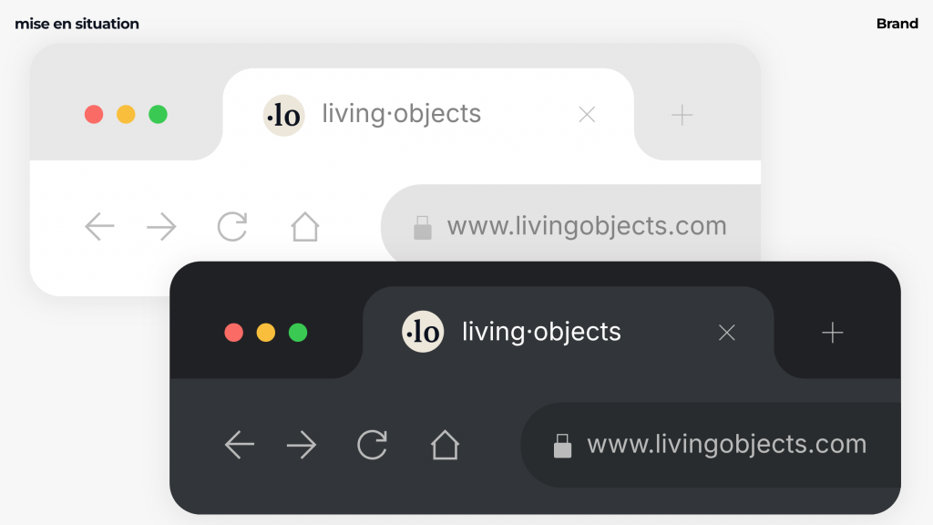
The middle dot makes it easier to read living·objects.
Distinctiveness
The use of the middle dot acts as a mark of identity punctuation: it gives rhythm to the reading, introduces a graphic pause, and serves as a visual landmark—thereby reinforcing the structure and uniqueness of the logotype.
Code
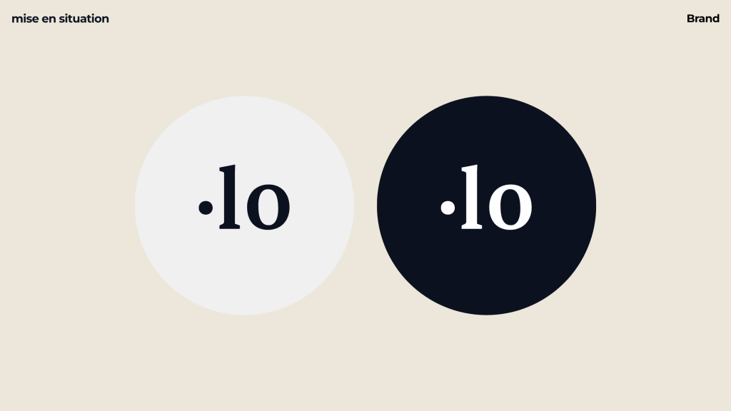
The integration of a shape evoking the numbers “1” and “0” refers to the world of binary code (1/0), creating a direct bridge to the digital and technological culture on which the brand’s identity is founded.
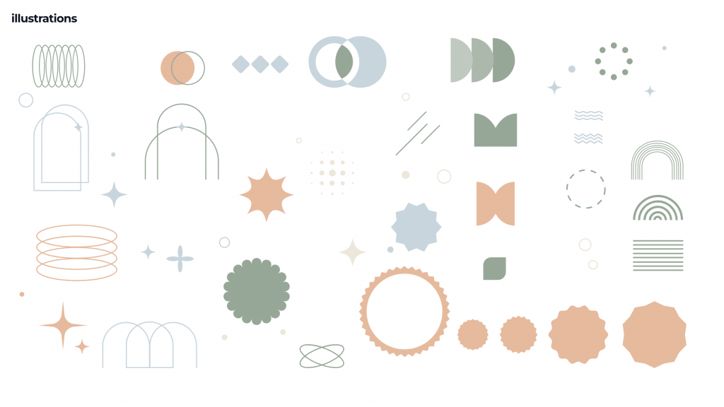
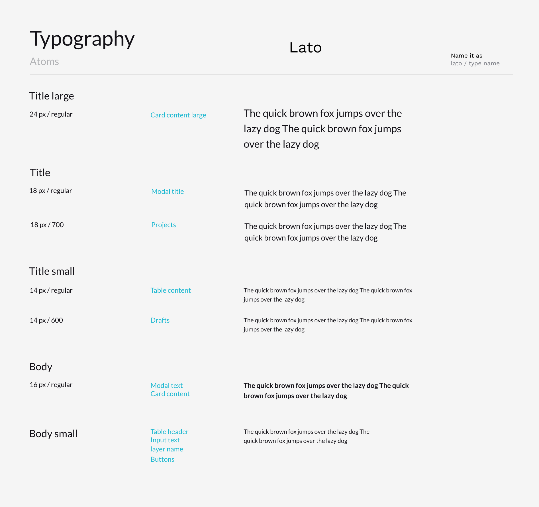
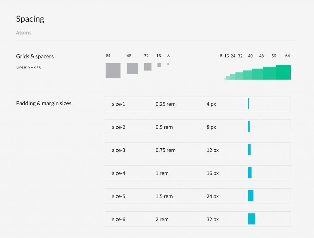
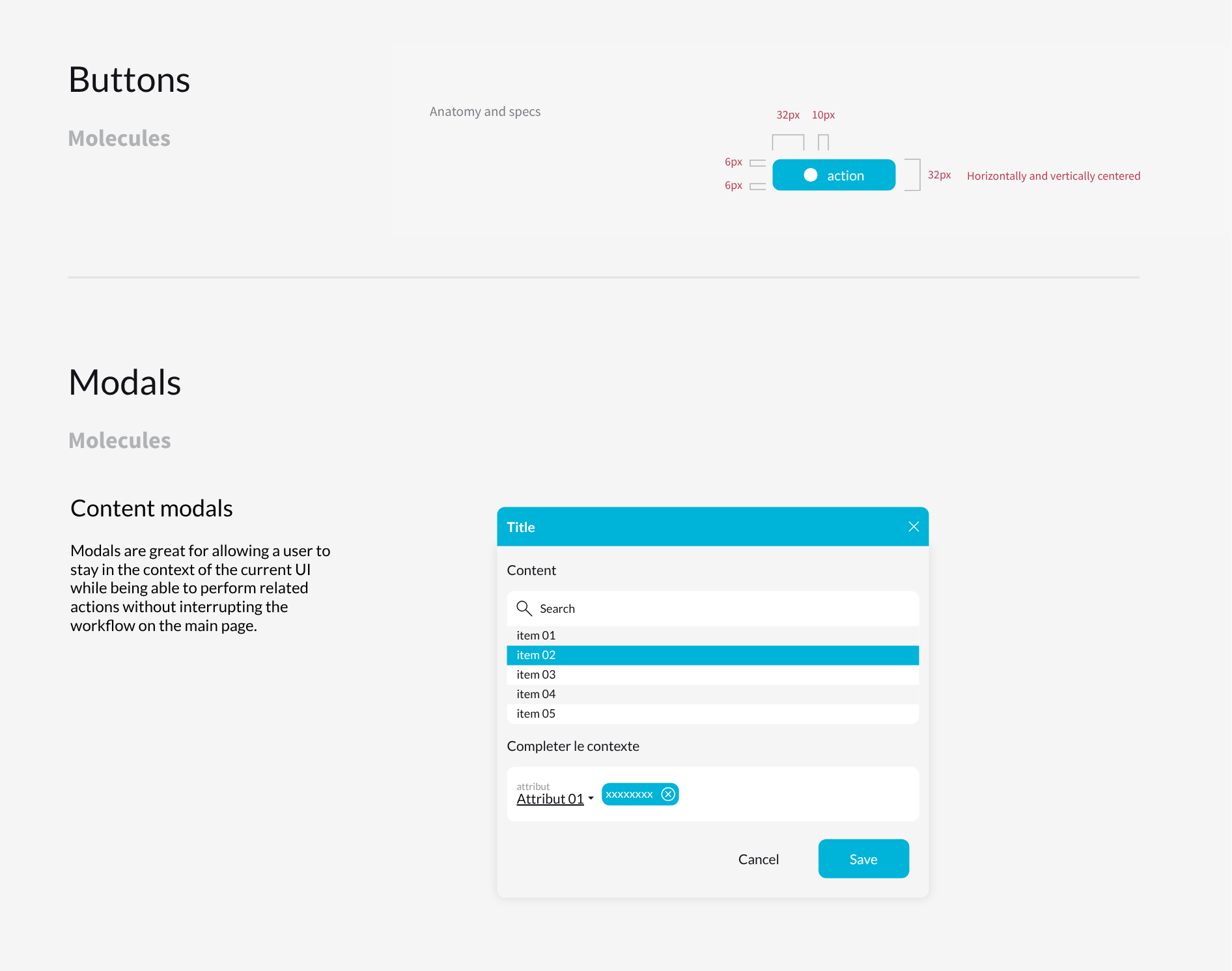
Design system

E-learning Onboarding Modules
living·objects builds Moodle-based LMS solutions designed to streamline corporate remote training. For a British Telecom onboarding programme delivered on their platform, I designed and animated a series of modules aimed at guiding new employees through core telecom network management concepts and internal workflows.
The brief required more than visual polish: each module had to translate technical, infrastructure-heavy content into clear, sequential animation, reducing cognitive load for employees with no prior exposure to the subject. Working closely with internal subject matter experts, I identified the minimum viable knowledge needed to be operational, then built motion sequences that isolate one concept at a time, using directional cues, timing, and visual hierarchy to guide attention before introducing the next step.
The result is a set of modules that function as functional documentation as much as branded content: animation here serves comprehension first, aesthetics second.