
Case study · Brand identity
Public sector · Civil aviation
DGAC.
The mission of the Directorate General for Civil Aviation is to ensure the safety and security of air transport by placing sustainable development at the heart of its actions.
It is responsible for all aspects of civil aviation: sustainable development, air safety, air security, air traffic control, economic regulation, support for aeronautical construction, general aviation and aeronautical training.
Key contributions
- Design a distinctive, memorable mark for the DGAC’s Comité Développement Durable.
- Deliver full colour, monochrome and reversed variants.
- Animate the mark for digital use.
- Make the identity hold across screens, print, signage and badges.
01 — The challenge
Distinctive, within the rules.
Creating a distinctive, memorable mark within a highly regulated institutional context, where visual codes are often rigid and creativity constrained by hierarchy and compliance.
Constraint 01
Rigid visual codes
An institutional environment with established conventions, where any new mark has to sit comfortably alongside official identities.
Constraint 02
Hierarchy & compliance
Creative choices that have to be justified and approved at many levels – the mark needs a clear, defensible rationale.
02 — The mark
One unit, three times.
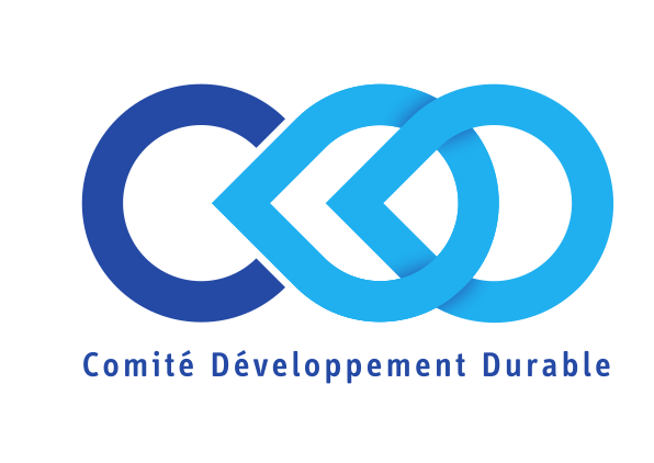
The mark draws on a single geometric unit – an arrow-ring – repeated and interlocked three times.
Three pillars
The three rings reference the three pillars of sustainable development: environmental, social and economic.
Interdependence
The interlocking structure suggests continuity, interdependence and forward motion.
Flight path
The circular dynamic echoes the flight path as a symbolic loop – a nod to aviation without literal aircraft iconography.

03 — Variants
Colour, mono, reversed.
Delivered in full colour, monochrome and reversed variants, the identity is designed to hold across digital interfaces, print materials and physical applications.
04 — Applications
From screen to badge.
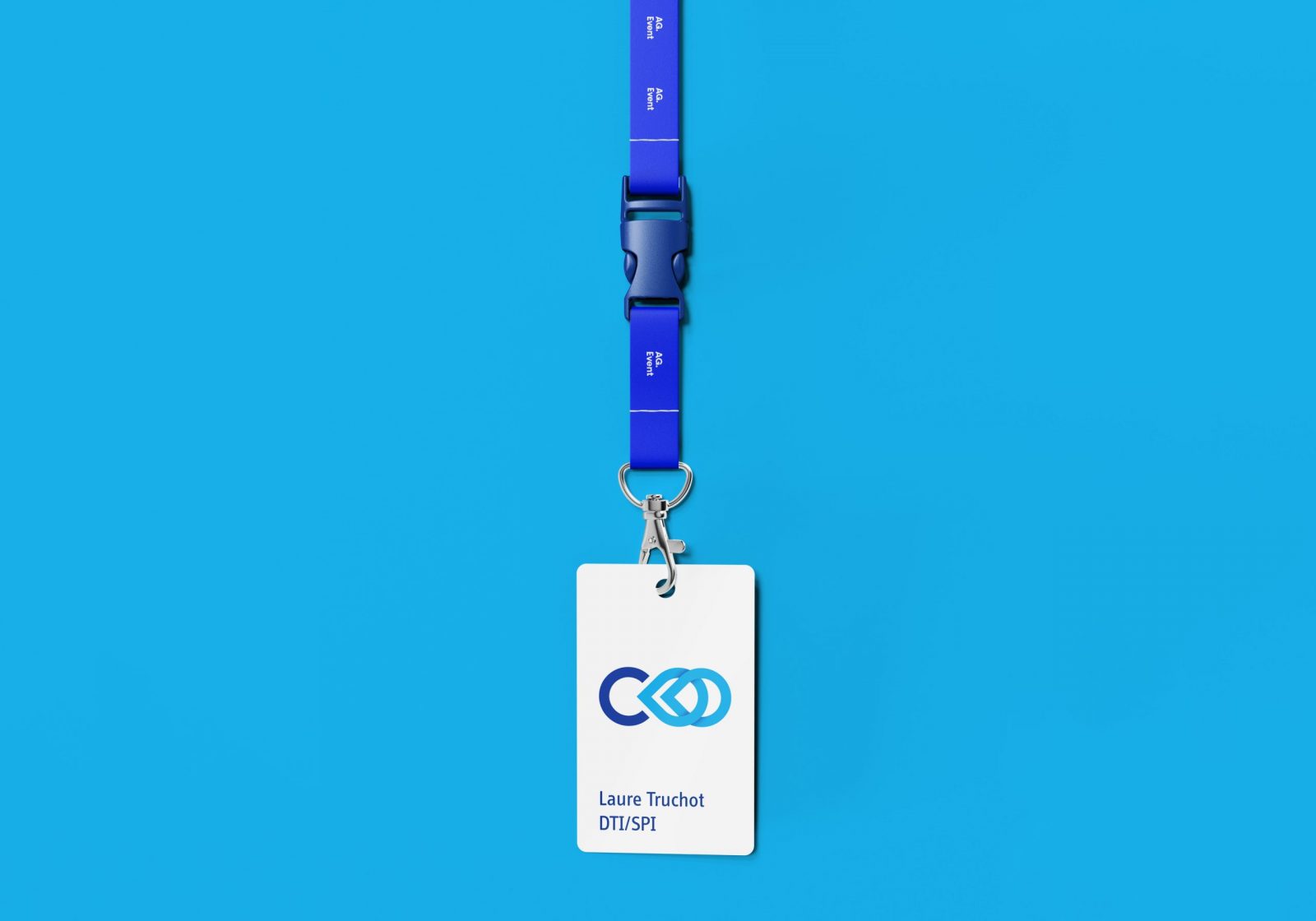
Digital interfaces, print materials and physical applications such as signage and badges: one mark, legible at every scale.
Outcome
A symbol with a reason to exist.
A mark whose every element can be explained – exactly what an institutional context requires.
i.
Meaningful
Three interlocked rings for the three pillars of sustainable development.
ii.
Versatile
Colour, monochrome and reversed variants for every medium.
iii.
Alive
An animated version for digital touchpoints.