Case study · Brand identity & motion
DeepTech · Social enterprise
Ithákê
Ithákê is a French DeepTech social enterprise founded in 2022. It uses artificial intelligence and data to help communities, businesses and citizens take concrete, measurable action toward ecological transition at a local level.
Operating at the intersection of scientific rigour and field experimentation, it coordinates networks of local actors – cooperatives, public authorities, private partners and engaged citizens – around shared environmental goals.
Key contributions
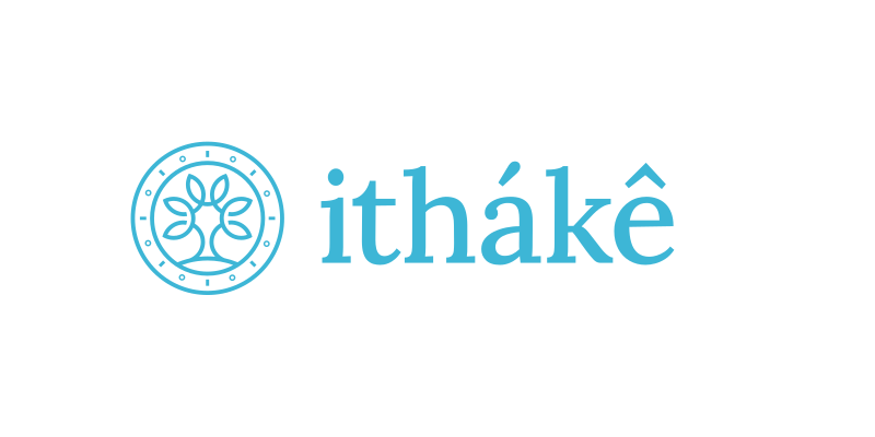
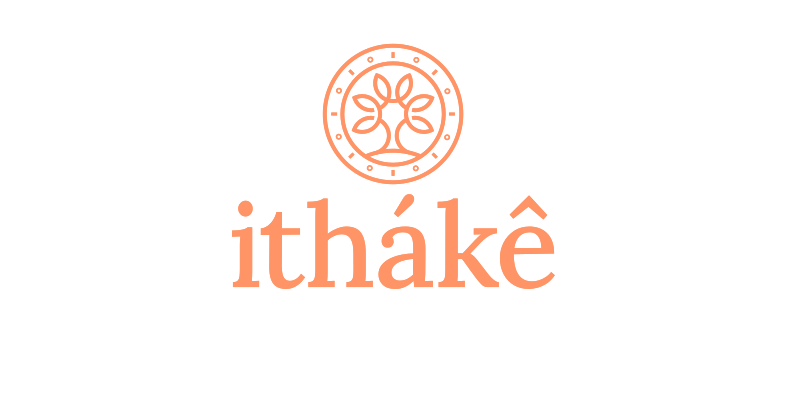
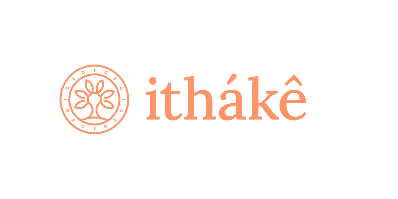
- Design the Ithákê mark and its vertical and horizontal lockups.
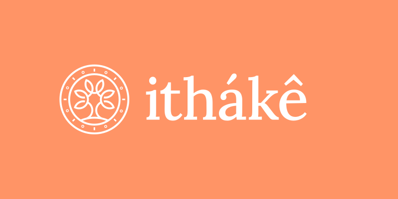
- Build a dual colour system: institutional blue, community salmon, monochrome.
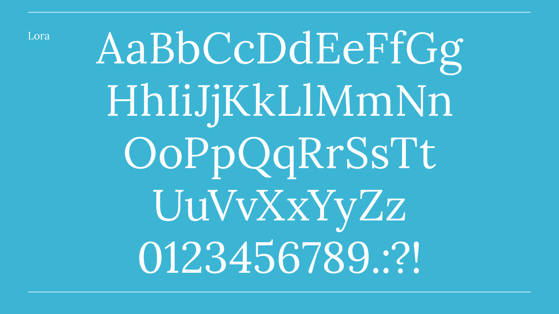
- Select a humanist typeface balancing credibility and warmth.
- Animate the logo for digital touchpoints.
01 — The challenge
An organisation that defies easy categorisation.
Ithákê is simultaneously a tech company, a cooperative network and a civic movement. The visual identity needed to bridge those worlds: credible enough for institutional partners and public authorities, warm and accessible enough for citizens and grassroots communities.
i.
A tech company
AI and data at the core, with the scientific rigour that implies.
ii.
A cooperative network
Local actors, public and private, coordinated around shared goals.
iii.
A civic movement
Engaged citizens and communities acting on the ground.
Risk 01
Too corporate
An identity built only for institutions would feel cold and distant to the citizens and communities Ithákê works with. It loses its soul.
Risk 02
Too informal
An identity built only for grassroots audiences would undermine trust with public authorities and partners. It loses its authority.
Too corporate and it loses its soul. Too informal and it loses its authority.
02 — The mark
Organic forms, precise structure.
The mark draws on organic, circular forms – evoking both natural systems and interconnected digital networks – grounded in a structure that reads as precise and intentional.
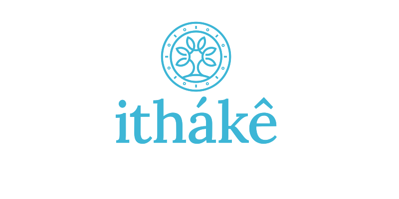
Organic
Circular forms borrowed from natural systems, the ground Ithákê works for.
Connected
The same forms read as interconnected networks – data, actors, territories.
Precise
A structure that reads as intentional, giving the mark institutional weight.
Humanist
A humanist typeface that balances technical credibility with human warmth.
03 — Motion
Designed to move from the outset.
Motion was integrated from the start, with an animated logo that brings the identity to life without losing its coherence as a static mark.

04 — Typography
Technical credibility, human warmth.
The humanist typeface reinforces the balance at the heart of the brand: serious enough for institutional documents, open and approachable for community-facing material.
05 — Colour
One identity, two voices.
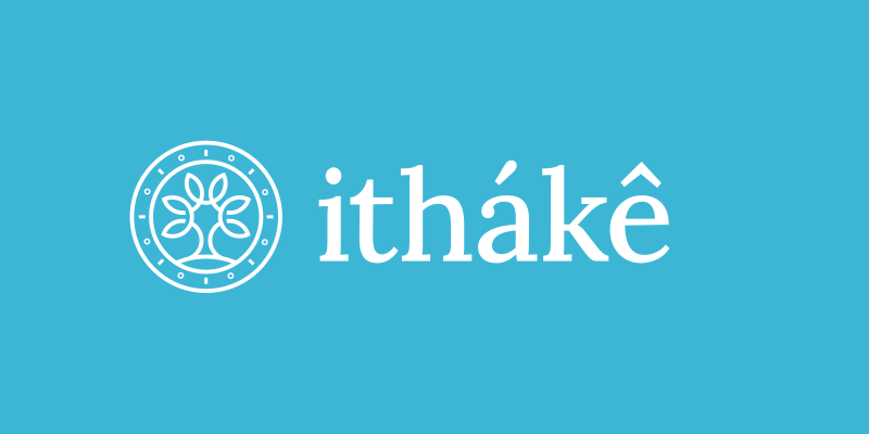
The colour system extends the brand’s duality: an institutional blue for contexts requiring authority and trust, an earthy salmon for community-facing applications, and a clean monochrome for versatility across print and digital.
06 — In context
From the field to the boardroom.
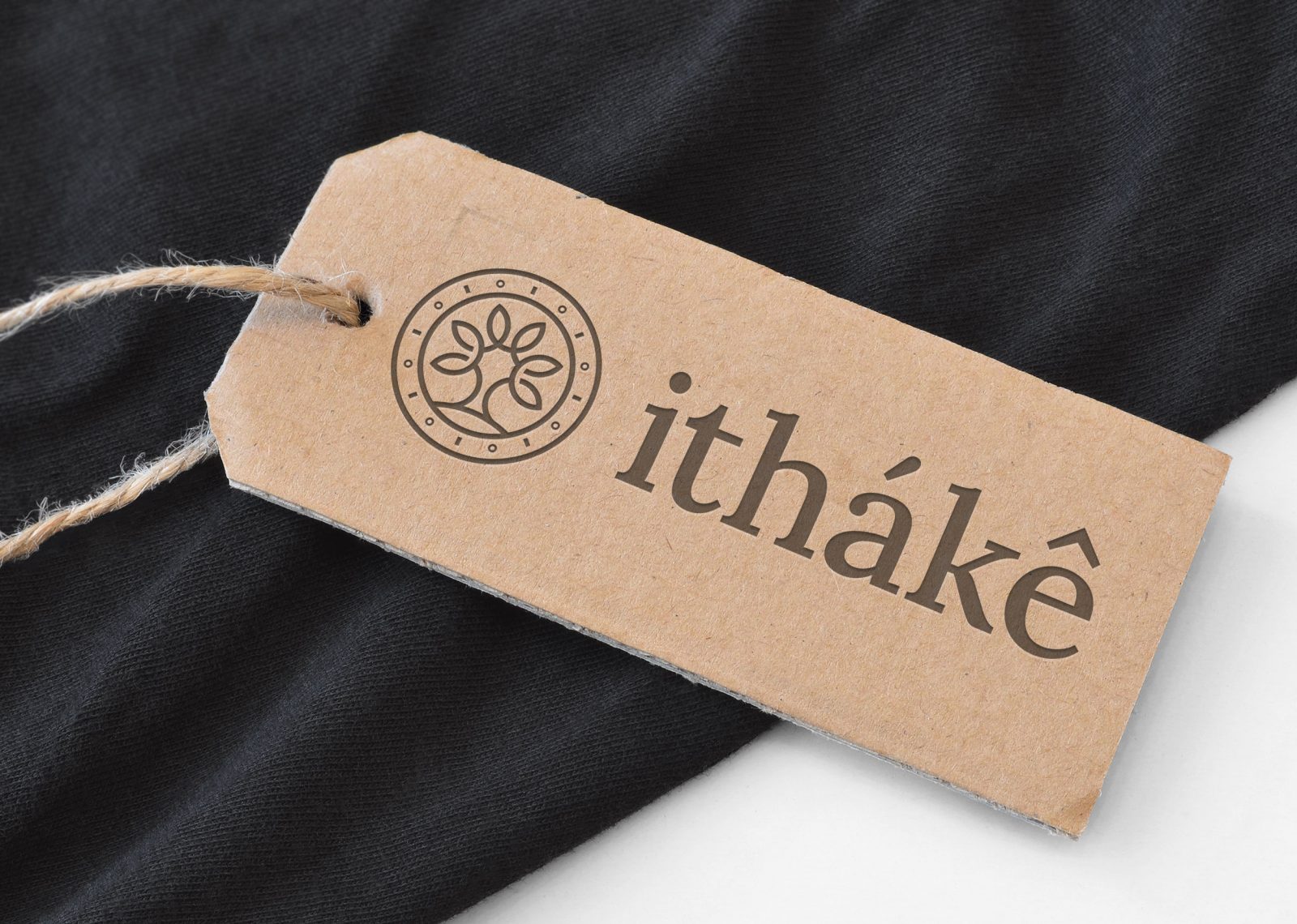
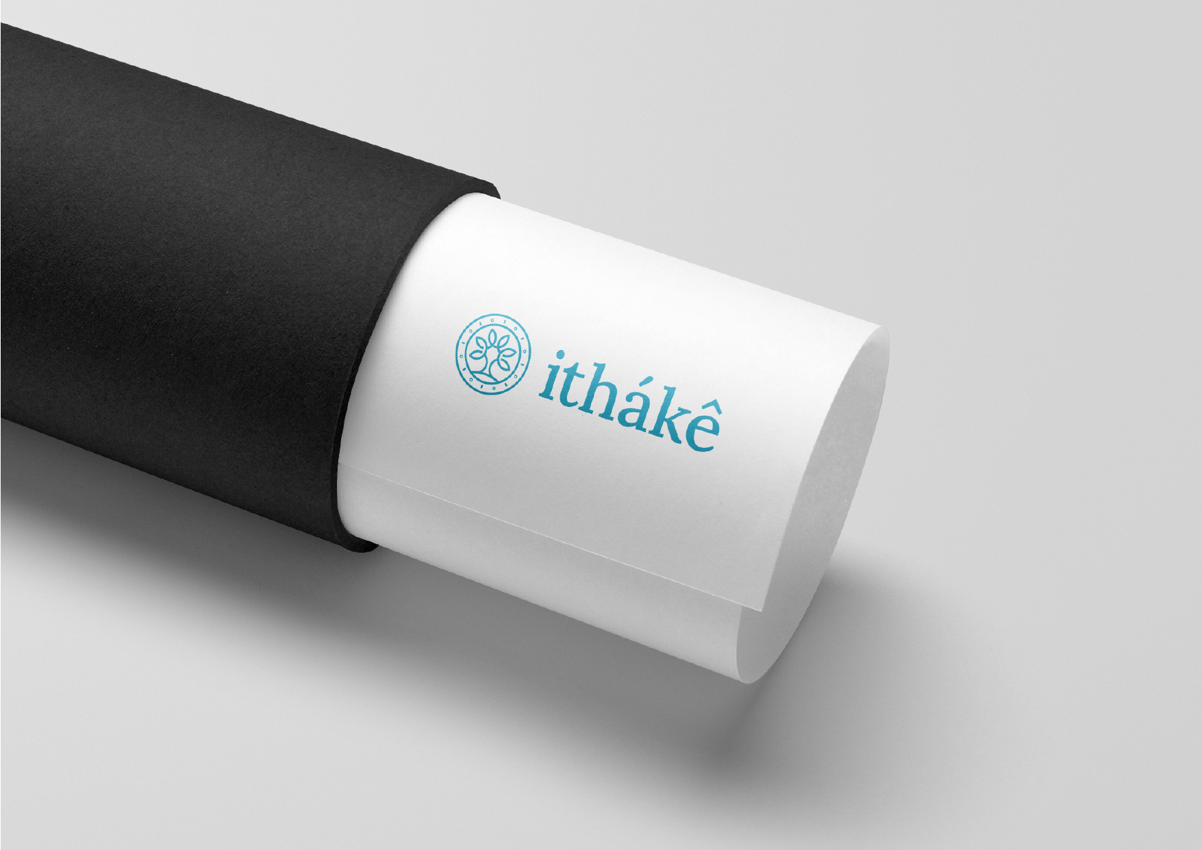
The same system carries from community events to institutional meetings, in print and on screen, without ever losing its coherence.


Outcome
One identity, three worlds.
A single system that speaks to institutions, communities and screens alike – without splitting the brand in two.
i.
Credible
A precise mark and an institutional blue that hold their own with public authorities and partners.
ii.
Warm
Organic forms and an earthy salmon that keep the brand accessible to citizens and communities.
iii.
Alive
An animated logo that brings the identity to life on every digital touchpoint.