Case study · Brand identity & product design
B2B · Telecom
living·objects
living·objects is a leading provider of network performance management solutions for operators and service providers. Its scalable platforms monitor, manage and optimise mobile, fixed and converged multi-technology infrastructure — and the services deployed on top of it.
The mission: define the company’s overall design and art direction, and elevate the UX/UI of its applications.
Key contributions
- Rebrand the living·objects visual identity.
- Build a coherent, distinctive art direction across every medium and touchpoint.
- Create a responsive design system.
- Design the user experience and interface of the applications.
01 — The challenge
A startup costume for an infrastructure partner.
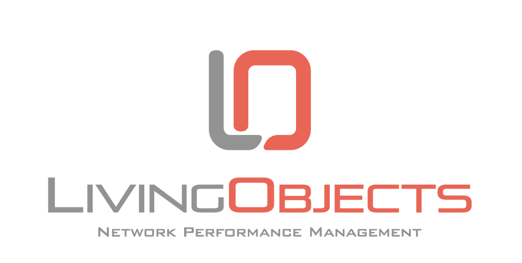
living·objects sells to enterprise telecom operators, yet its identity was playful and colourful — right for a consumer startup, wrong for an institutional market. In front of operators, the brand said “innovative startup” when it needed to say “established, trustworthy infrastructure partner.”
Problem 01
Too illustrative, too detailed
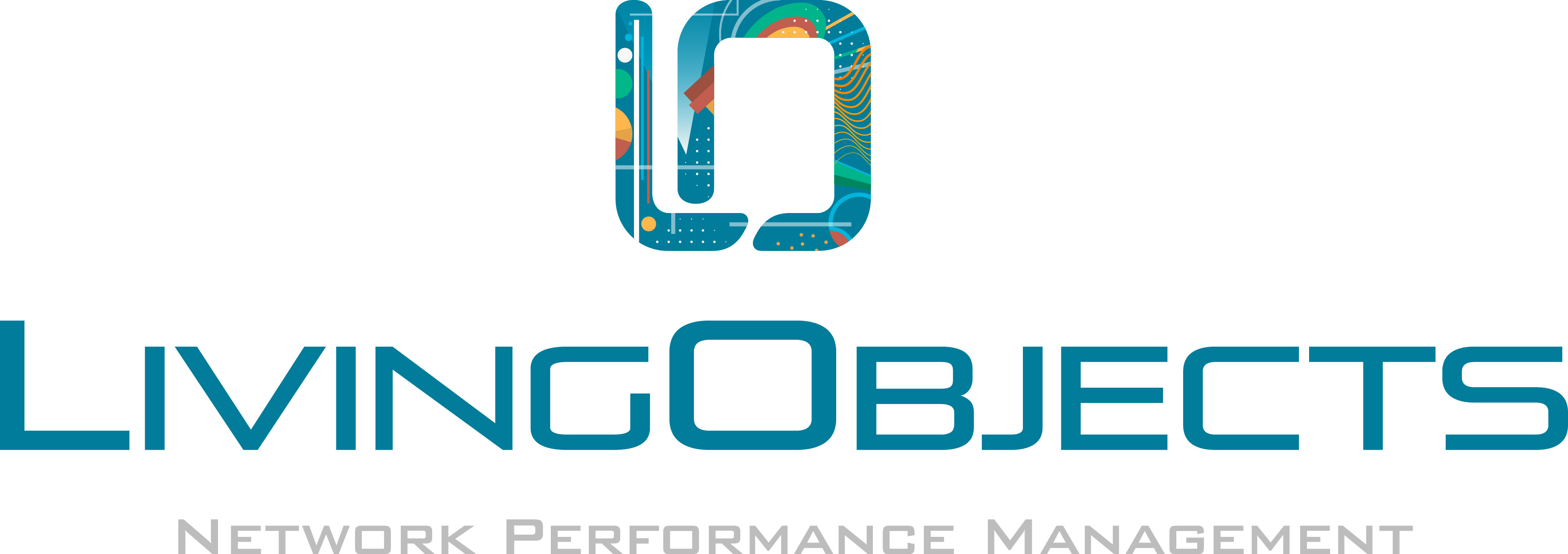
A complex network illustration with gradients, curves and inner patterns. At small sizes — favicon, email signature — the detail turned to mud. It lacked the simplicity a B2B mark requires.
Problem 02
Generic typography
A standard, interchangeable sans-serif shared by thousands of companies. It said nothing about the brand’s positioning or personality.
Problem 03
Limited flexibility
The mark only worked in full colour. Its inner patterns made monochrome and single-colour reproduction impossible — a basic requirement for professional materials.
Problem 04
Visual imbalance
A heavy, detailed symbol paired with thin, light type. The logo felt top-heavy and unstable, especially in small applications.
02 — The goal
Reimagine the identity from the ground up.
Not a facelift: a new visual foundation able to carry the company’s ambitions with enterprise clients, and to extend naturally into the product.
- i.
Establish institutional credibility
Convey maturity, stability and trustworthiness — the qualities enterprise clients need to see.
- ii.
Create a distinctive, memorable mark
A visual signature unique to living·objects that could never be confused with a competitor.
- iii.
Scale across every application
A mark that works from a 16 px favicon to a 300 ft billboard. No compromise at any size.
- iv.
Support a cohesive design system
Go beyond the logo to a complete visual language spanning every digital and physical touchpoint.
- v.
Communicate technological sophistication
Reflect the innovation and precision of the platform, not just its purpose.
03 — The transformation
Four decisions, one signature.
Every element of the new logotype has a reason to exist. Together they turn a name into a mark: calm, legible, and unmistakably living·objects.
Maturity
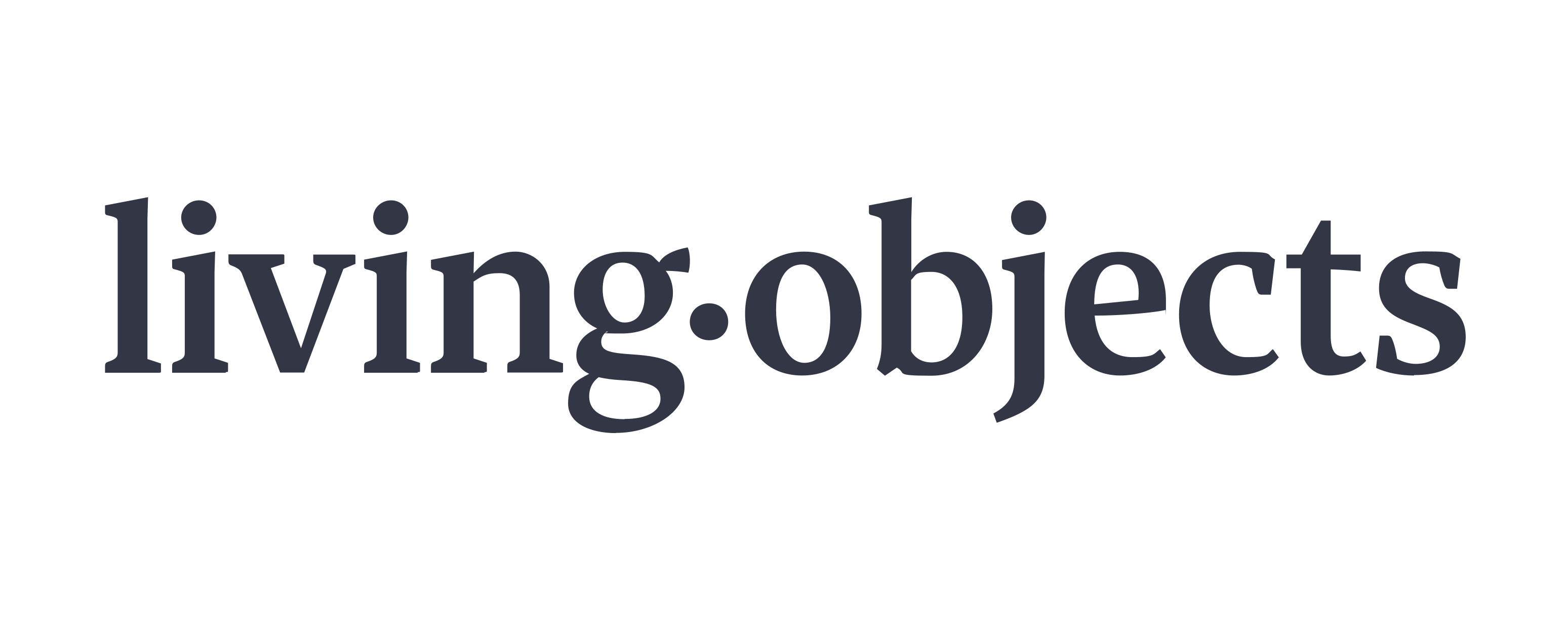
A serif typeface creates tension between tradition and modernity. Its thick/thin contrast structures reading, grounds the brand institutionally and stabilises the logotype.
Readability
The middle dot separates the two words, making living·objects instantly readable.
Distinctiveness
The dot acts as identity punctuation: it gives rhythm, introduces a graphic pause and becomes a visual landmark unique to the brand.
Code
A shape evoking the digits “1” and “0” nods to binary code, bridging the identity to the digital culture the company is built on.
Design system
One language,
from atom to page.
The rebrand gave living·objects a voice. The design system made it speak consistently — across a monitoring platform used by telecom engineers every day, its marketing site and every piece of collateral. A single source of truth for colour, type, spacing and components, built to scale with the product rather than around it.
01 — Method
Built like chemistry, not like a style guide.
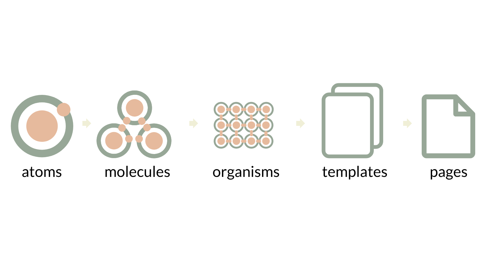
Following Brad Frost’s atomic design, every interface element is decomposed into its smallest reusable parts. Designers and developers share the same vocabulary, and a change to one atom propagates predictably through the whole product.
Atoms
Colour, type, spacing, icons — the non-negotiable tokens.
Molecules
Buttons, inputs, chips, search fields combining atoms with a single purpose.
Organisms
Modals, data tables, cards and navigation — complete functional blocks.
Templates
Dashboard, list and detail layouts defining the skeleton of each screen.
Pages
Real content in real templates: where the system is tested against reality.
02 — Colour
Quiet, warm, deliberate.
A mineral palette replaces the old saturated gradients. A deep ink anchors credibility; sage and peach bring warmth without noise. Secondary tints are reserved for illustration and data categories, so meaning is never carried by colour alone.
Inside the product, a single functional cyan is reserved for interaction — primary actions, selection and focus — so engineers scanning dense dashboards always know what is clickable.
03 — Typography
A serif for the brand, a workhorse for the data.
The identity relies on a contrasted serif to express maturity. The interface relies on Lato: neutral, highly legible at small sizes, with the weights needed to build hierarchy in dense tables.
Brand
Serif display
Logotype, headlines, editorial moments. Thick/thin contrast for institutional presence.
Interface
Lato — 400 · 600 · 700
Every product surface, from dashboards to modals. Named lato / type-name in the library.
| Token | Size / weight | Used for | Specimen |
|---|---|---|---|
| title-large | 24 px / 400 | Card content large | Network availability |
| title | 18 px / 400 | Modal title | Edit monitoring context |
| title-strong | 18 px / 700 | Projects | SD-WAN — Europe West |
| body | 16 px / 400 | Modal text, card content | Latency exceeded the threshold on 3 sites. |
| title-small | 14 px / 400 | Table content | Paris-CE-04 · 12.4 ms · 99.98 % |
| title-small-strong | 14 px / 600 | Drafts | Draft report — Q3 |
| body-small | 13 px / 400 | Table header, inputs, buttons | SITE · DEVICE · STATUS |
04 — Spacing
An 8-point rhythm.
Every margin, padding and grid gap derives from a single base unit. Designers stop guessing, developers stop rounding, and screens built months apart still align to the pixel.
Grids & spacers
linear · y = x + 8Padding & margin tokens
05 — Components
Specified down to the pixel.
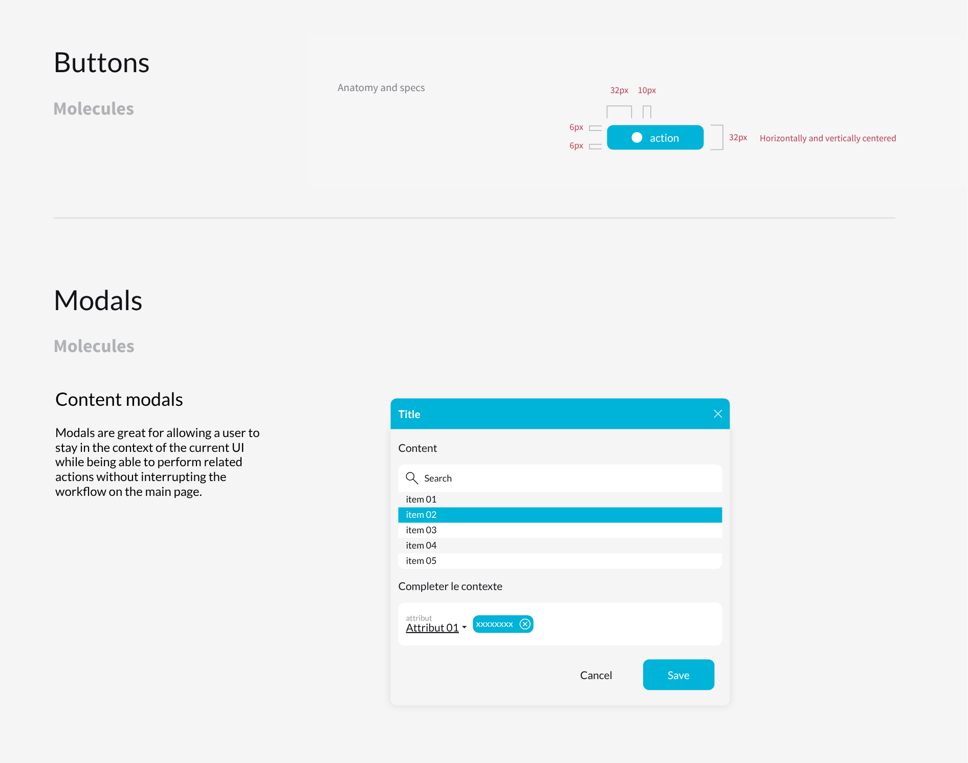
Each molecule ships with its anatomy, states and rules of use. Modals let operators act without losing the context of the dashboard they are investigating — a critical need when an incident is unfolding.
Button anatomy
- Height32 px
- Vertical padding6 px
- Icon → label gap10 px
- Icon zone32 px
- Alignmentcentred H + V
06 — Iconography & illustration
Precision, with a human touch.
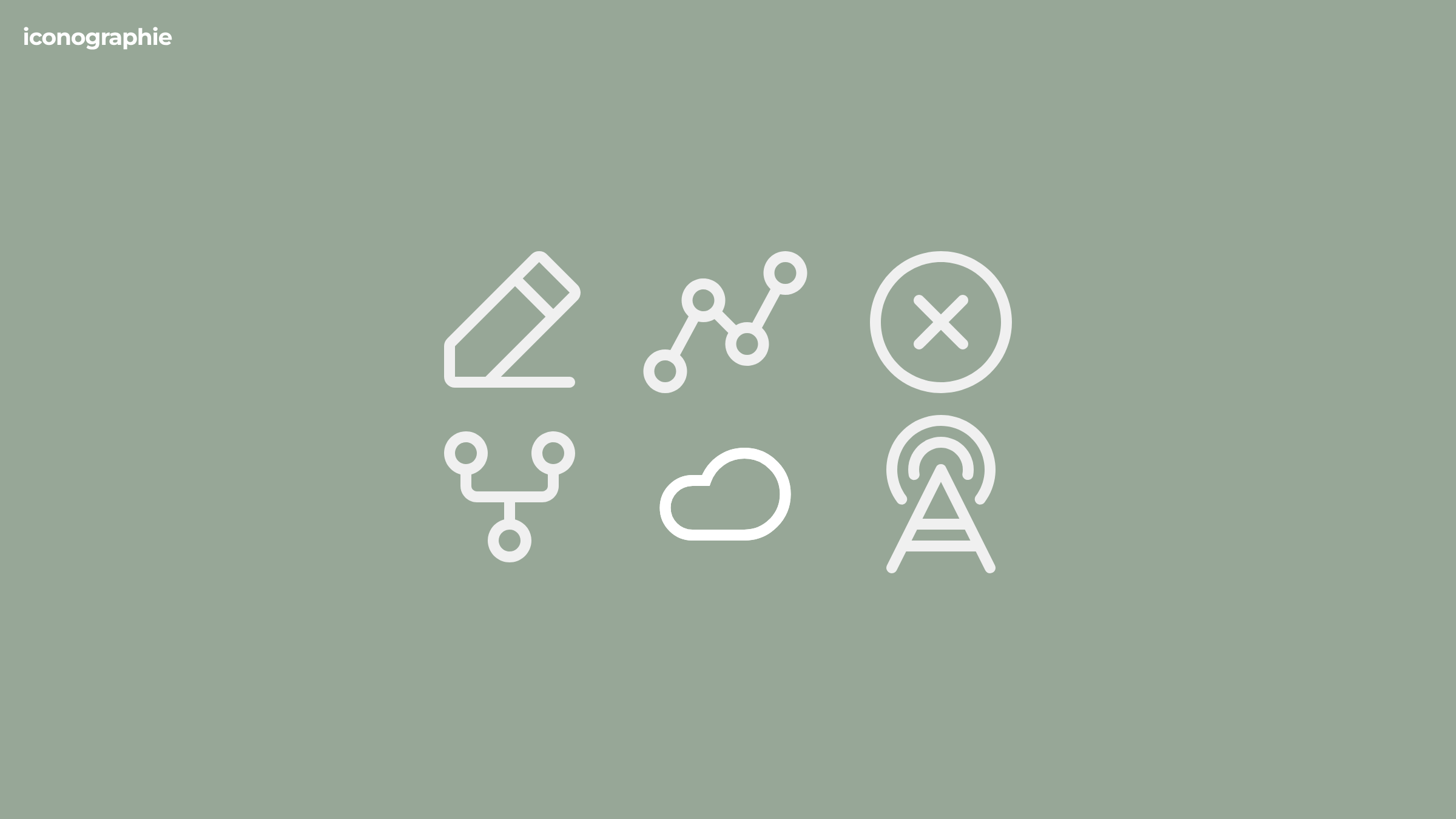
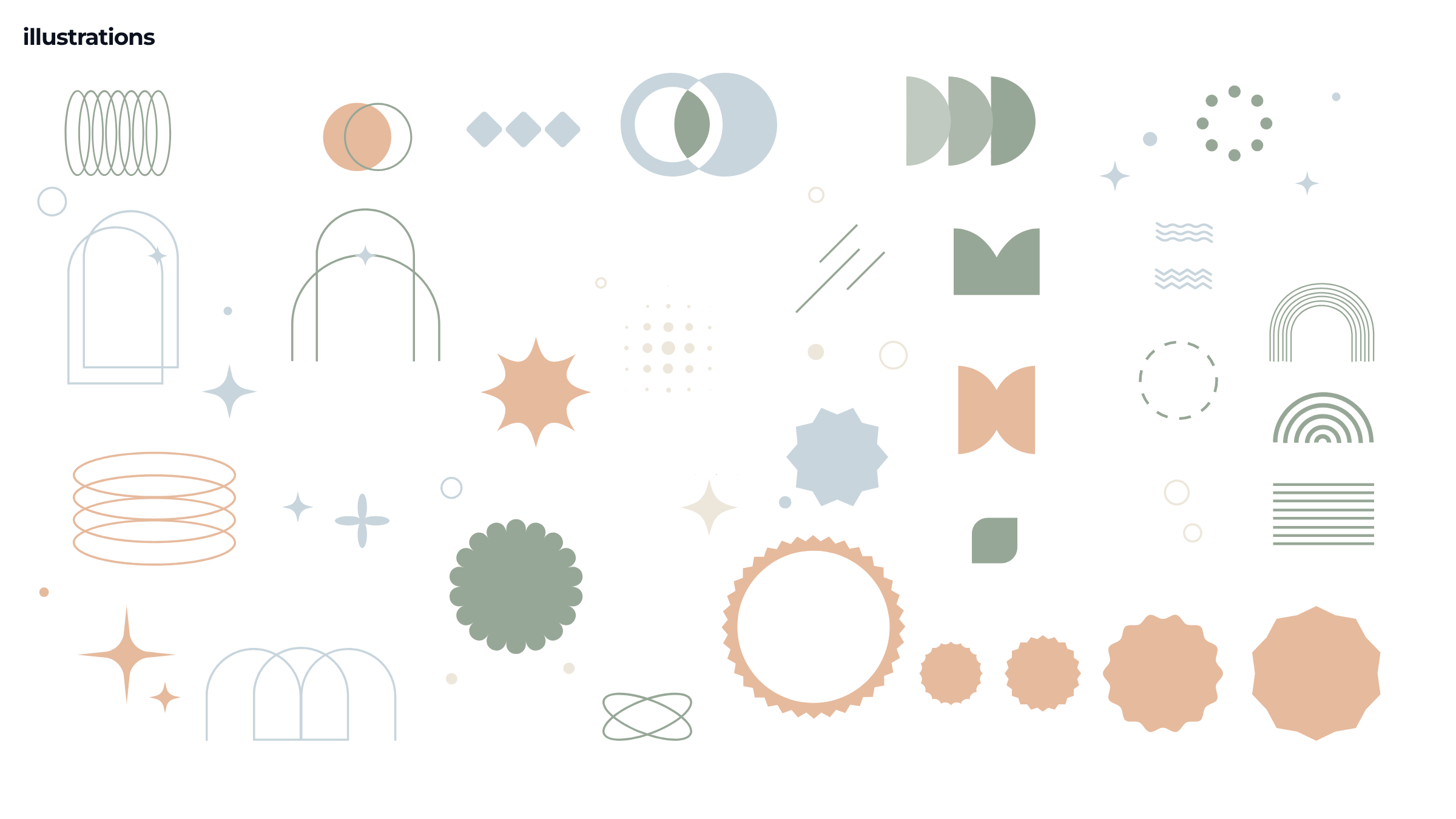
Icons share a single rounded stroke and geometry grid, speaking the vocabulary of networks — nodes, paths, antennas, cloud. A library of abstract shapes extends the palette into illustration, softening technical content without ever becoming decorative clutter.
07 — In context
Down to 16 pixels.
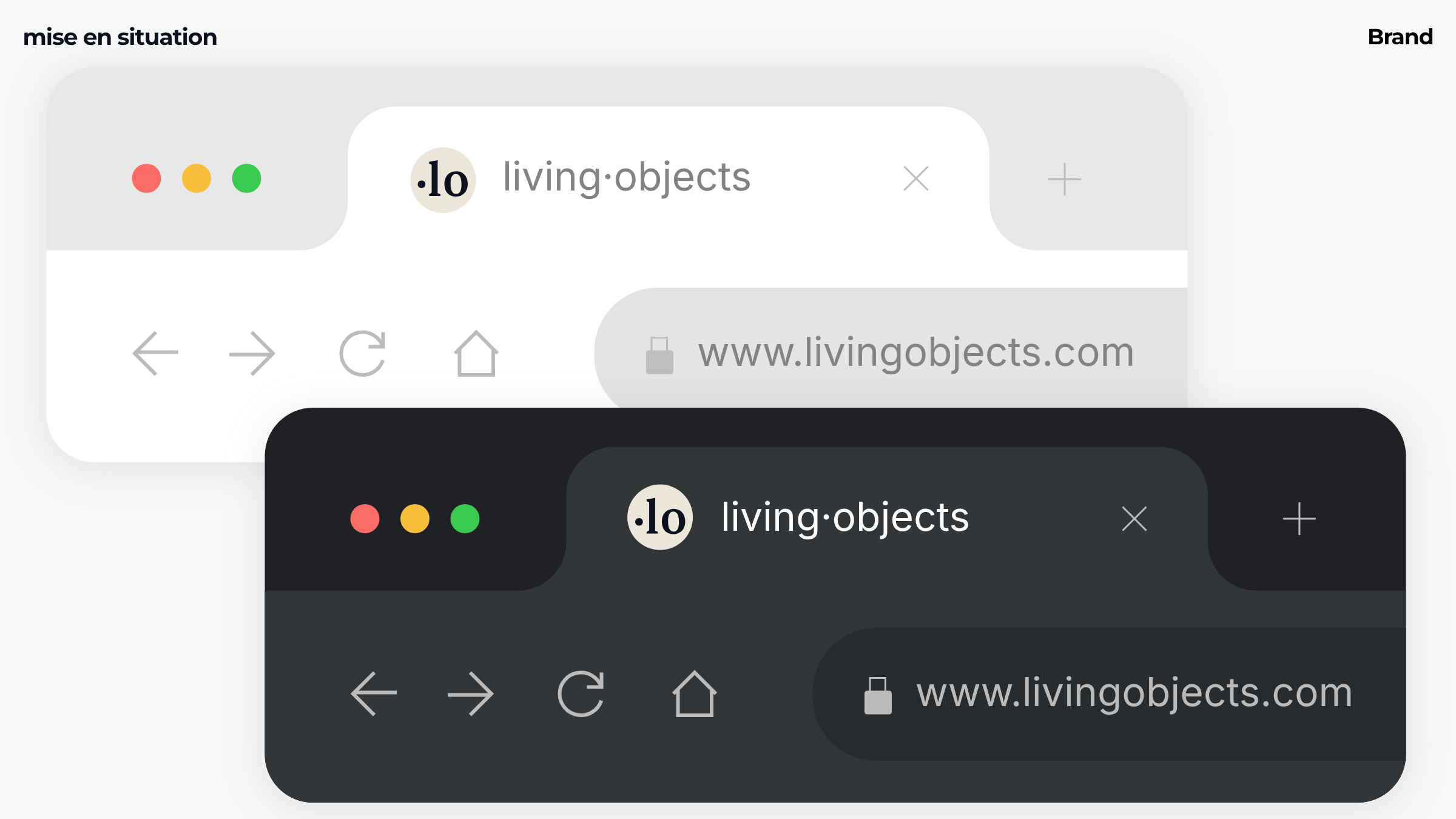
The ·lo monogram was designed for the smallest surfaces first: favicon, app icon, avatar. It holds in light and dark themes, in one colour, at any size — exactly what the previous identity could not do.
Outcome
What the system changed.
Beyond visual consistency, the design system became shared infrastructure between design, product and engineering.
i.
One vocabulary
Designers and developers name the same things the same way, from Figma layers to CSS tokens.
ii.
Faster delivery
New screens are assembled from tested components instead of being redesigned from scratch.
iii.
A credible product
The platform finally looks like the brand promises: calm, precise, enterprise-ready.
E-learning onboarding modules
Motion that teaches.
living·objects builds Moodle-based LMS solutions that streamline corporate remote training. For a British Telecom onboarding programme delivered on the platform, I designed and animated a series of modules guiding new employees through core network management concepts and internal workflows.
Animation here serves comprehension first, aesthetics second.
01 — Approach
One concept at a time.
The brief required more than visual polish: technical, infrastructure-heavy content had to become clear, sequential animation that lowers cognitive load.
Brief
Translate complexity
Turn dense telecom infrastructure topics into content a newcomer can follow without prior exposure to the subject.
Method
Minimum viable knowledge
With internal subject matter experts, I isolated exactly what a new employee needs to know to be operational — and nothing more.
Motion
Guide the eye
Each sequence isolates a single concept, using directional cues, timing and visual hierarchy to focus attention before introducing the next step.
Result
Documentation that moves
Modules that work as functional documentation as much as branded content — reusable references long after onboarding.
02 — Modules
Six modules, from first login to SD-WAN.
From a guided tour of the LiveSP interface to advanced use cases, each module follows the same visual grammar so learners can focus on the content, not the format.